Recreating the the data visualization of W.E.B Du Bois from the 1900 Paris Exposition using modern tools. See the challenge presentation.
Setup
library(tidyverse)
library(glue)
library(ggtext)
library(showtext)

font_add_google("Play", family = "dubois")
showtext_auto()
Data
We add the margin descriptions in the data.frame.
data_05 <- read_csv("data.csv") |>
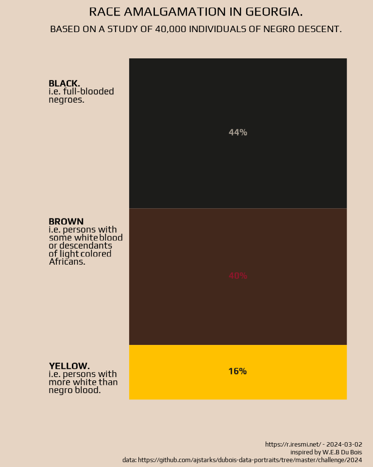
mutate(label = c("**BLACK.**
i.e. full-blooded
negroes.",
"**BROWN**
i.e. persons with
some white blood
or descendants
of light colored
Africans.",
"**YELLOW.**
i.e. persons with
more white than
negro blood."))Plot
It’s a barplot at an arbitrary x = 1 position with text annotations.
data_05 |>
  ggplot(aes(1, Percentage, fill = Category)) +
  geom_col() +
  geom_richtext(aes(label = paste0("**", Percentage, "%**"), color = Category),
            family = "dubois",
            size = 5,
            fill = NA, label.color = NA,
            position = position_stack(vjust = 0.5)) +
  annotate("richtext",
           family = "dubois",
           lineheight = .25,
           size = 5,
           x = 0.2,
           hjust = 0,
           y = cumsum(rev(data_05$Percentage)) - 10,
           label = rev(data_05$label),
           fill = NA, label.color = NA) +
  scale_fill_manual(values = list("Black" = "#1C1C1A",
                                  "Brown" = "#42281C",
                                  "Yellow" = "#FFC100")) +
  scale_color_manual(values = list("Black" = "#A2998D",
                                   "Brown" = "#8B162A",
                                   "Yellow" = "#1C1C1A")) +
  labs(title = str_to_upper("Race amalgamation in Georgia."),
       subtitle = str_to_upper("Based on a study of 40,000 individuals of negro descent."),
       x = "",
       y = "",
       caption = glue("https://r.iresmi.net/ - {Sys.Date()}
                      inspired by W.E.B Du Bois
                      data: https://github.com/ajstarks/dubois-data-portraits/tree/master/challenge/2024")) +
  theme_minimal() +
  theme(text = element_text(family = "dubois", size = 20, lineheight = .5),
        panel.background = element_rect(fill = NA, color = NA),
        panel.grid = element_blank(),
        axis.text.x = element_blank(),
        axis.text.y = element_blank(),
        plot.title = element_text(size = 20, hjust = 0.5),
        plot.subtitle = element_text(size = 15, hjust = 0.5),
        plot.background = element_rect(fill = "#E6D4C3", color = NA),
        plot.margin = margin(.2, .3, .1, .3, "cm"),
        plot.caption = element_text(size = 10, lineheight = .5),
        legend.position = "none",
        plot.caption.position = "plot")