library(tidyverse)
library(sf)
library(janitor)
library(ggspatial)
library(glue)
library(ggtext)

# Parallel reduce by moodymudskipper
# https://github.com/tidyverse/purrr/issues/163
# It will allow us to iterate on a dataframe and accumulate each plot on the map
preduce <- function(.l, .f, ..., .init, .dir = c("forward", "backward")) {
  .dir <- match.arg(.dir)
  reduce(transpose(.l), function(x, y) exec(.f, x, !!!y, ...), .init = .init, .dir = .dir)
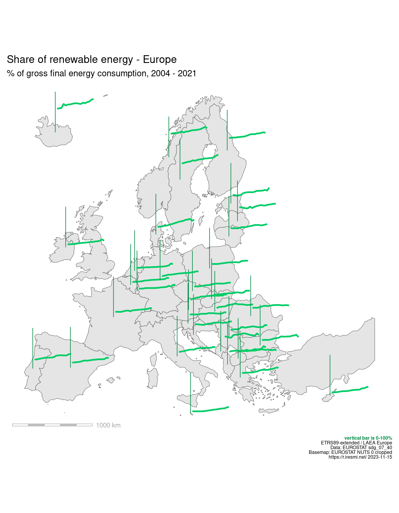
}Day 14 of 30DayMapChallenge: « Europe » (previously).
Using data from Eurostat we will try to show the spatio-temporal properties of this dataset by placing plots of the renewable energy share change on the map, for each country.
There is a JSON API but this TSV is easier to manipulate…
# https://ec.europa.eu/eurostat/web/main/data/database
# Share of renewable energy in gross final energy consumption by sector. Code: sdg_07_40
# https://ec.europa.eu/eurostat/databrowser/view/sdg_07_40/
renewable <- read_delim("https://ec.europa.eu/eurostat/estat-navtree-portlet-prod/BulkDownloadListing?file=data/sdg_07_40.tsv.gz",
                        delim = "\t",
                        na = ":",
                        trim_ws = TRUE,
                        name_repair = make_clean_names) |>
  separate(nrg_bal_unit_geo_time,
           into = c("nrg_bal", "unit", "geo"),
           sep = ",") |>
  pivot_longer(4:last_col(),
               names_to = "year",
               names_transform = parse_number,
               values_to = "pcent") |>
  filter(nrg_bal == "REN",
         str_length(geo) == 2)

min_year <- min(renewable$year)
max_year <- max(renewable$year)

# Base map: NUTS
# https://ec.europa.eu/eurostat/web/gisco/geodata/reference-data/administrative-units-statistical-units/nuts#nuts21
nuts_0 <- read_sf("NUTS_RG_20M_2021_3035.shp") |>
  clean_names() |>
  filter(levl_code == 0) |>
  st_crop(c(xmin = 2500000,
            xmax = 7000000,
            ymin = 1330000,
            ymax = 5480000))
We nest the dataset by country and add each country plot as a ggplot grob in a new column.
make_ren_plot <- function(df) {
  { df |>
    ggplot(aes(year, pcent)) +
    geom_line(color = "springgreen3", linewidth = 1) +
    scale_x_continuous(limits = c(min_year, max_year)) +
    scale_y_continuous(limits = c(0, 100)) +
    theme_void() +
    theme(plot.background = element_rect(fill = NA, color = NA),
          axis.line.y = element_line(color = "#008B45")) } |>
    ggplotGrob()
}

renewable_plots <- renewable |>
  nest(.by = geo) |>
  mutate(p = map(data, make_ren_plot))
After building the base map, we get the “center” of each country and add their plot.
base_map <- nuts_0 |>
  ggplot() +
  geom_sf() +
  labs(title = "Share of renewable energy - Europe",
       subtitle = glue("% of gross final energy consumption, {min_year} - {max_year}"),
       caption = glue("<b style='color:springgreen4'>vertical bar is 0-100%</b><br />
                      {st_crs(nuts_0)$Name}<br />
                      Data: EUROSTAT sdg_07_40<br />
                      Basemap: EUROSTAT NUTS 0 cropped<br />
                      https:∕∕r.iresmi.net/ {Sys.Date()}")) +
  coord_sf() +
  annotation_scale(height = unit(1, "mm"),
                   text_col = "darkgrey", line_col = "grey",
                   bar_cols = c("white", "grey")) +
  theme_void() +
  theme(plot.margin = margin(0, .3, 0.1, .3, "cm"),
        plot.caption = element_markdown(size = 6),
        legend.text = element_text(size = 7),
        plot.background = element_rect(color = NA, fill = "white"))

# add one plot on a map
add_ren_plot <- function(map, p, loc_x, loc_y) {
  map +
    annotation_custom(grob = p,
                      xmin = loc_x,
                      xmax = loc_x + 500000,
                      ymin = loc_y,
                      ymax = loc_y + 500000)
}

# build the final map
nuts_0 |>
  st_point_on_surface() |>
  mutate(loc_x = st_coordinates(geometry)[, 1],
         loc_y = st_coordinates(geometry)[, 2]) |>
  select(cntr_code, loc_x, loc_y) |>
  st_drop_geometry() |>
  inner_join(renewable_plots, join_by(cntr_code == geo)) |>
  select(loc_x, loc_y, p) |>
  preduce(add_ren_plot, .init = base_map)
Still some work to do to get to 100% renewable in most of Europe…
