library(tidyverse)
library(fs)
library(janitor)
library(osmdata)
library(sf)
library(terra)
library(glue)
library(memoise)

invisible(
  Sys.setlocale(category = "LC_ALL",
                locale = "en_GB.UTF8"))


#' Geolocate using OSM (Nominatim API)
#'
#' using first result
#' Memoized function
#'
#' @param location (char): place name (geocodable via OSM)
#'
#' @returns (SpatVector): first result
geolocate <- memoise(function(location) {
  loc <- getbb(location, format_out = "sf_polygon")  |>
    slice_head(n = 1) |>
    st_point_on_surface()

  message(glue("{loc$display_name} — WGS84 : {loc$geometry}"))

  return(loc|>
           st_transform("IGNF:NTFLAMB2E") |>
           as("SpatVector"))
})

#' Generate a monthly temperature chart since 1970
#'
#' @param sim2 (data.frame): Météo-France SIM2 data over the period
#' @param month (char): month number "01"..."12"
#' @param location (char): place name (geocodable via OSM); memoized
#' @param output_dir (char): directory path where a PNG file will be written, if not NULL
#'
#' @returns (ggplot and optionally a file on disk)
generate_chart <- function(
    sim2,
    month,
    location,
    output_dir = NULL) {
  stopifnot(month %in% sprintf("%02d", 1:12))
  month_name <- format(ymd(glue("0000-{month}-01")), "%B")

  sim2_raster <- sim2 |>
    filter(str_detect(date, glue("{month}$"))) |>
    mutate(
      x = lambx * 100,
      y = lamby * 100,
      layer = date,
      temp = t,
      .keep = "none") |>
    rast(
      type = "xylz",
      crs = "IGNF:NTFLAMB2E")

  loc <- geolocate(location)

  temperatures <- sim2_raster |>
    terra::extract(loc) |>
    select(-ID) |>
    pivot_longer(
      cols = everything(),
      names_to = "month",
      values_to = "temperature") |>
    mutate(
      year = as.integer(str_sub(month, 1, 4)),
      anomaly = temperature - mean(temperature[year >= 1991 & year <= 2020],
                                   na.rm = TRUE))

  p <- temperatures |>
    ggplot(aes(year, anomaly)) +
    geom_col(aes(fill = anomaly)) +
    geom_smooth(method = "loess",
                formula = y ~ x) +
    scale_fill_gradient2(
      high = scales::muted("red"),
      mid = "white",
      low = scales::muted("blue")) +
    scale_x_continuous(breaks = scales::breaks_pretty()) +
    scale_y_continuous(breaks = scales::breaks_pretty()) +
    labs(
      title = glue("Average monthly anomaly temperature — {month_name}"),
      subtitle = location,
      x = "year",
      y = "departure from average* (°C)",
      fill = "°C",
      caption = glue(
        "https://r.iresmi.net/ — {Sys.Date()}
         data: Météo-France SIM2 — *baseline: 1991–2020 normal for {month_name}")) +
    theme(
      text = element_text(family = "Ubuntu"),
      plot.caption = element_text(size = 7))

  if (!is.null(output_dir)) {
    dir_create(output_dir)

    ggsave(
      glue("{output_dir}/tm_{month}_{make_clean_names(location)}.png"),
      plot = p,
      width = 20,
      height = 20 / 1.618,
      units = "cm",
      dpi = 150)
  }

  return(p)
}
As France enters its second heatwave of 2026, can we produce more detailed plots than the excellent visualizations provided by ShowYourStripes?
MétéoFrance offers its monthly SIM2 dataset albeit over a shorter time span (currently 1970–2025). The dataset includes temperature, precipitation and other variables on an 8 km resolution grid.
We will select a French city, retrieve its geographic coordinates, build the grid for a specific month over the 1970–2025 period, extract the data from the grid at that location and plot the temperature anomaly.
We will use {terra} to create the grid from the tabular files containing cell centers and weather variables, and terra::extract() to get all temperatures.
The data is a bunch of compressed CSV.
# https://meteo.data.gouv.fr/datasets/65e040c50a5c6872ebebc711
# Climate change data - monthly SIM
# all files MENS_SIM2_*-*.csv.gz
sim2 <- dir_ls("data") |>
  read_delim(
    delim = ";",
    locale = locale(decimal_mark = "."),
    name_repair = make_clean_names)
Now we just call our function.
generate_chart(sim2,
               month = "06",
               location = "Paris, France")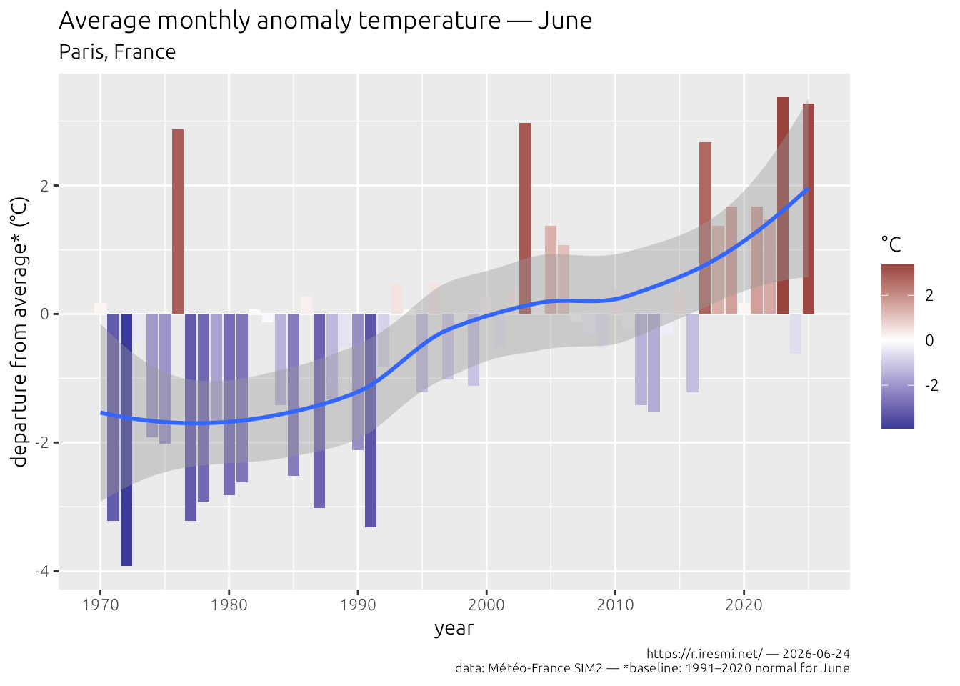
Find the root cause of this trend on this other post…
If we want each month, we can iterate on a vector of months:
# for each month
sprintf("%02d", 1:12) |>
  map(\(x) generate_chart(sim2,
                           month = x,
                           location = "Grenoble, France",
                           output_dir = "results"),
  .progress = TRUE)
Note that scales are not constant across plots; if we want to compare months (or places) we should fix the y-axis and the color scale. It’s left as an exercise to the reader if you want to make a nice poster…