


Codes postaux
R
spatial
datavisualization
30DayMapChallenge
french


Bike accidents
R
spatial
datavisualization
30DayMapChallenge
OSM

Greenland ice thickness
R
spatial
datavisualization
30DayMapChallenge
raster

Birth date temperature
R
spatial
datavisualization
30DayMapChallenge
raster

Whales movements
R
spatial
datavisualization
30DayMapChallenge
ecology

Global discret grids
R
spatial
datavisualization
30DayMapChallenge


Street names
R
spatial
datavisualization
Parquet
OSM
30DayMapChallenge


Birds in atmosphere
R
30DayMapChallenge
spatial
datavisualization
ecology

El niño anomaly
R
30DayMapChallenge
spatial
datavisualization
remote sensing

Defibrillator from OSM
R
30DayMapChallenge
spatial
datavisualization
OSM

Renewable energy in Europe
R
30DayMapChallenge
spatial
datavisualization

Clustering points to polygons
R
30DayMapChallenge
spatial
datavisualization
OSM Guadeloupe trail relation
R
30DayMapChallenge
spatial
OSM
datavisualization


Map your Strava activities
R
datavisualization
spatial
sport
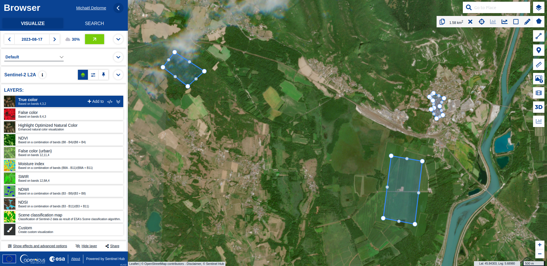
Sentinel
R
30DayMapChallenge
datavisualization
spatial
raster
remote sensing


Use data from Wikipedia
R
30DayMapChallenge
datavisualization
spatial
webscraping
Wikipedia

The giant French Olympic-size swimming pool
R
30DayMapChallenge
datavisualization
spatial
OSM

Use data from Openstreetmap
R
30DayMapChallenge
datavisualization
spatial
OSM
Opening a spatial subset with {sf}
R
30DayMapChallenge
datavisualization
spatial

My air travel carbon footprint
R
30DayMapChallenge
datavisualization
spatial


Polygons to hexagons
R
datavisualization
french
spatial
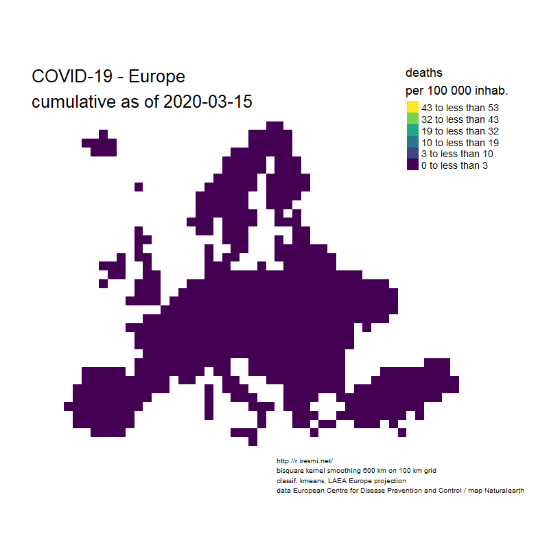
COVID-19 decease animation map
R
datavisualization
raster
spatial
french
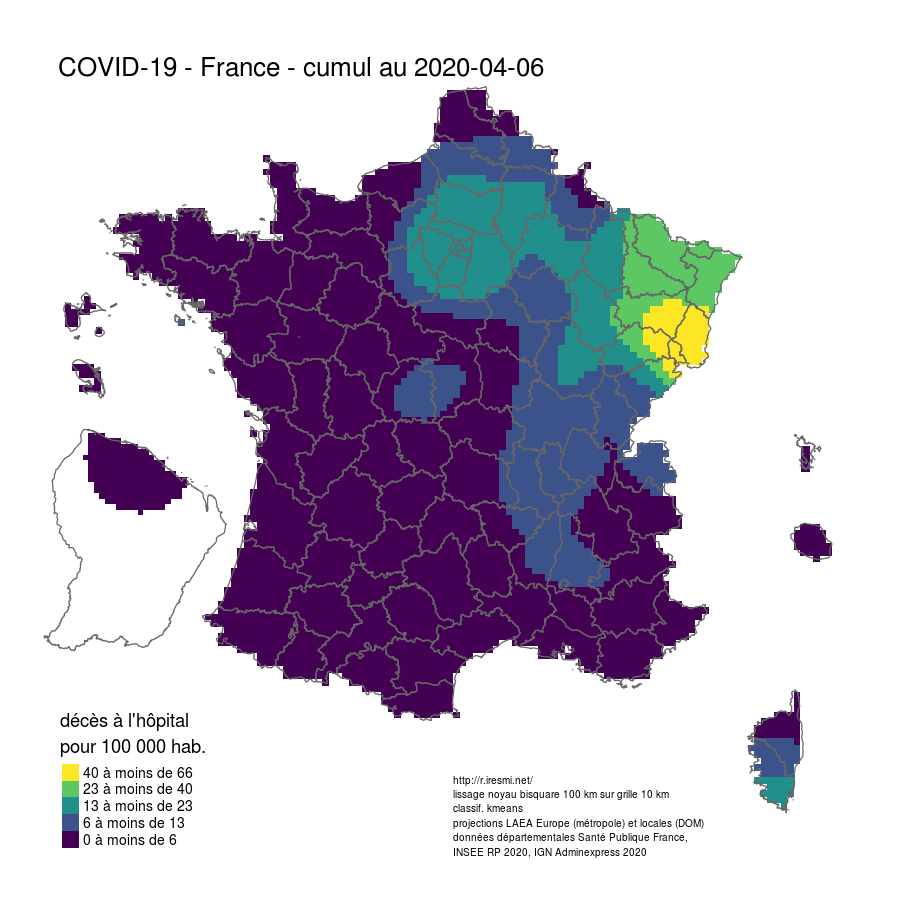
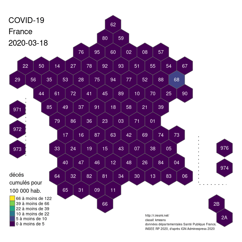
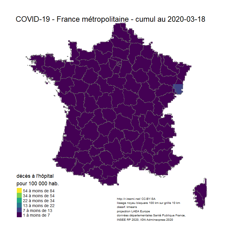
Coronavirus : spatially smoothed decease in France
R
french
raster
spatial


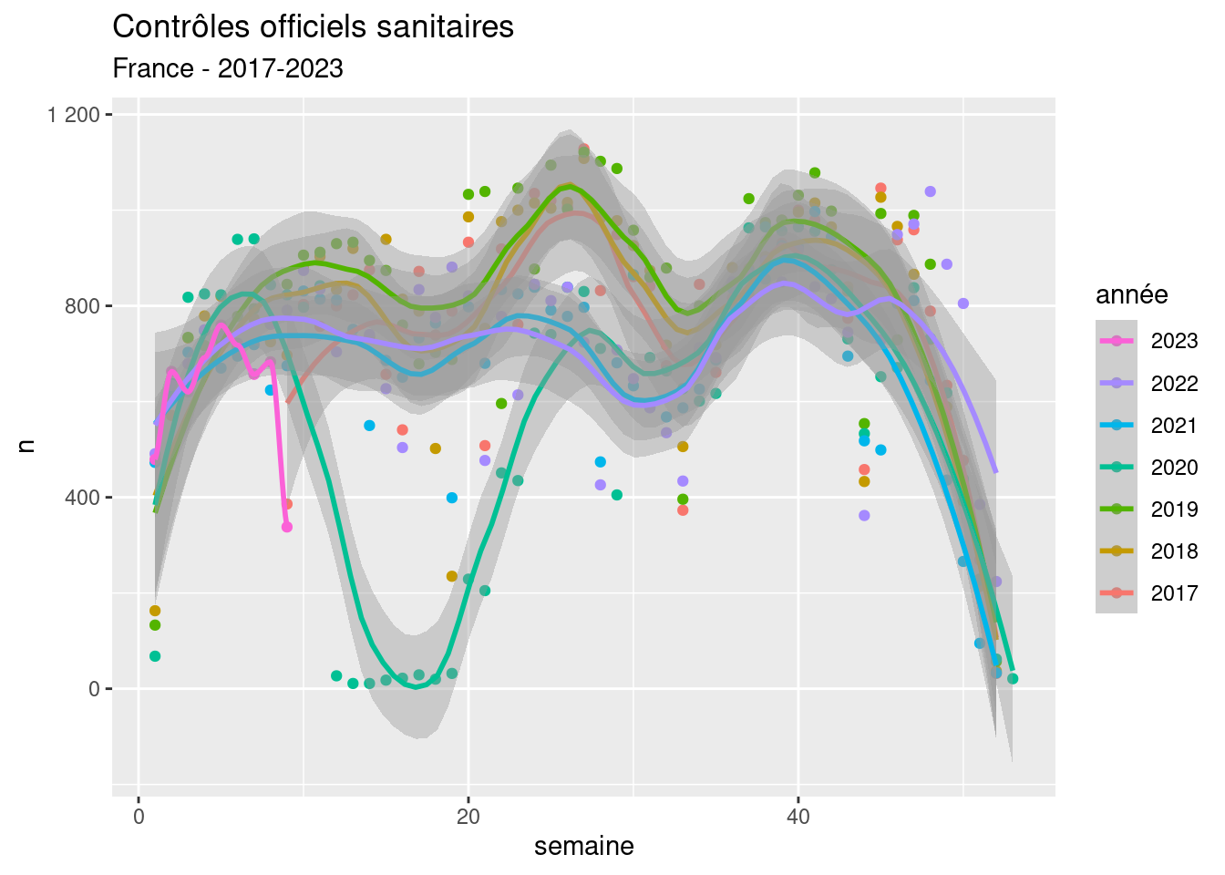
Mapping multiple trends with confidence
R
datavisualization
spatial
modelling

No matching items